Mistake Number Four: Artwork Overload
One of the most detrimental packaging design mistakes is having confusing artwork and graphics. This misstep can significantly affect a brand’s image. In their eagerness to share their brand story, many brands end up with designs that are excessively wordy and cluttered with graphics, leading to confusing and unappealing packaging.
Achieving Clean and Visually Appealing Designs
Achieving a successful design begins with clean, visually appealing images. The most impactful packaging uses a streamlined design and effectively leverages various technologies used in making the package. This includes printing technology, the choice of inks, and finishes like registered matte or spot gloss. The package format and the inclusion of convenience features also play significant roles.
When all these elements are harmoniously integrated into a design, the result is packaging that stands out and enhances a brand’s image. Consumers appreciate packaging that is clear, easy to understand, and aesthetically pleasing, thereby fostering a positive perception of the brand. This can lead to increased brand loyalty and sales.
Design Examples and Techniques
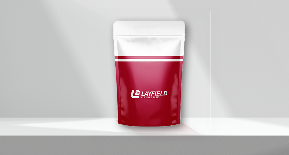
For example, a thoughtfully designed bag might feature a recognizable logo highlighted by a metallized background. Combining a lighter finish with a matte texture can give the package a sophisticated, steely appearance. A paper-like background can add an organic feel, making the packaging more appealing. Highlighting specific elements, such as a brand mascot, with spot gloss can make them pop, ensuring they catch the consumer’s eye.
Different materials can also enhance the packaging’s functionality and appeal. For instance, incorporating a clear window on the side lets consumers see the product inside. Convenience features, like a clean scoreline for easy tearing, contribute to a premium experience. A well-designed audible zipper can enhance the user experience, making the package feel more secure and high-quality.
Understanding Your Target Market
When designing your packaging, it’s crucial to be well-informed about your target market. Different markets have unique preferences and requirements. For instance, the pet food industry includes various segments such as the dry kibble market, veterinarian market, independent retailers, big box retailers, and online markets. Each of these segments demand specific design considerations. By understanding these preferences, you can tailor your packaging to meet their needs and stand out in the market.
Leveraging Advanced Printing Technologies
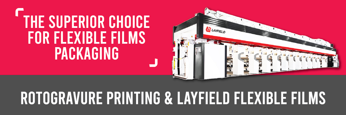
In addition to design, high-quality photography and leveraging advanced printing technologies are essential. For example, Rotogravure printing offers fewer limitations in image trapping than flexographic printing, which might require more image trapping and can slightly compromise image quality. Understanding the capabilities and limitations of digital, flexographic, and Rotogravure printing technologies can help you make informed decisions for your packaging design.
By carefully considering these factors, you can create packaging that looks great and resonates with your target market. Stay tuned for more insights into different printing technologies and their pros and cons in our upcoming post.
Stay Informed and Engaged
We invite you to stay informed and engaged with our latest insights and innovations. Continue to check out our blog for more tips and detailed information on packaging design and technology advancements. Making the right choices for your packaging can significantly impact your brand’s success and consumer perception.
Related Articles
View All News